
You are currently browsing the category archive for the ‘Data Release’ category.
Somehow I missed this early but the FRED now has 96 disaggregated construction series. Let me show you how deep the rabbit hole goes.
Here is Total Construction Spending: Religious. That’s right people, I’ve got spending on churches.

Or how about this Total Public Construction Spending, Sewage and Waste Disposal

And here is Total Construction Spending, Conservation and Development. I am not even sure exactly what that is!. That’s how good this data set is.

And I still don’t even have that Excel thingy installed yet.
“A slow sort of country!” said the Queen. “Now, here, you see, it takes all the running you can do, to keep in the same place. If you want to get somewhere else, you must run at least twice as fast as that!” -Lewis Carroll, Through the Looking Glass
I have constructed a chart extrapolating the trend growth in nominal GDP* through 2013, along with the FOMC’s forecast of nominal growth through 2013.** Have a look:
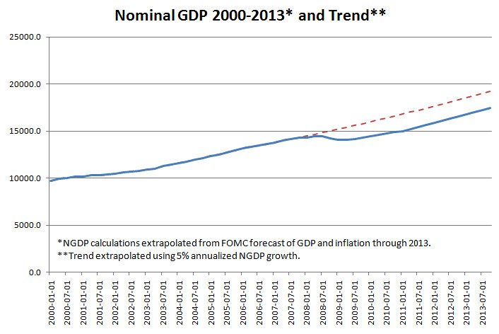
[Click Image to Enlarge]
As you can see, by the Fed’s own forecast, we will remain under trend growth in NGDP through 2013. Indeed, by the fourth quarter, we will be 10.2% below the trend. That is roughly $1.7 trillion in potential output! I regard this as the “one chart to rule them all”, and it is what I point to when people ask me why we are experiencing a sluggish “jobless” recovery.
Always keep in mind, though, prediction is a fools errand over anything but the shortest of time spans. The key here is that there is only one way the prediction can be off such that it would benefit the economy. Those aren’t good odds to take.
*FRED
**Average of the central tendency.
I was going to write up a post on my exasperation at the Fed’s recent meeting statement, but Ezra Klein got to it before me and did a good job, so you should go read what he has to say. One point that I want to highlight, because I have made the point that the dual mandate is mostly just an insiders joke:
Paragraph two: We admit everything is terrible. In fact, it’s so terrible that it means we’re failing our mandate. “Measures of underlying inflation are currently at levels somewhat below those the Committee judges most consistent, over the longer run, with its mandate to promote maximum employment and price stability. With substantial resource slack continuing to restrain cost pressures and longer-term inflation expectations stable, inflation is likely to remain subdued for some time before rising to levels the Committee considers consistent with its mandate.”

[Image Courtesy of David Beckworth]
How many of you wish that you had a job where you could consistently fail at the very time when it is clutch that you deliver in a big way? How many of you would like to say, “Well, I have a model of the economy that says we won’t be hitting any of our own targets…but oh well”? The Federal Reserve is in the exact position in the economy where they can act quickly and decisively and actually make a large impact on nominal spending. I would even go as far as to say that they can do so without “long and variable lags”, as markets should price in actions by the Fed nearly immediately, and indeed they have been.
Contrary to the popular narrative, I believe that it is this very passivity by the Fed that brought us to the brink in the fall of 2008, when every indicator of economic activity (industrial output, consumer spending, business confidence, NGDP expectations, etc.) were found to be in sudden free-fall mode. At that time, interest rates were in the 1.5%-2% range, and the Fed’s target was still 2% until October 2008!
And here we are, fully two years later, and we still cannot get the Fed to act…nor can we get the executive branch of government to take the problem seriously! This inaction belies an institution that either is ill-equipped to respond when necessary, or is structured in a way that prevents decisive action. Since I believe that the Fed has all the tools it needs (it being a monetary superpower), I would place the blame on the structure of the network.
There is nothing more important on the Fed’s plate right now than bringing nominal spending back in line with the previous trajectory of NGDP. Not only to assist 50 million people who are currently unemployed, and help numerous others rebuild their balance sheets…but to save our economy from the whims of populist sentiment that will likely take hold if our economic malaise continues for very much longer. That means rounds and rounds of fiscal stimulus. That means the development of an entire class of freeters who never reach full potential. And most importantly, that means the loss of real goods and services that could otherwise be produced in our economy — which translates into a lower real standard of living for everyone.
At this point I would do anything for a little more monetary stimulus.
it is hard to see how the Fed can do much to cure this [worker mismatch] problem. Monetary stimulus has provided conditions so that manufacturing plants want to hire new workers. But the Fed does not have a means to transform construction workers into manufacturing workers.
~Narayan Kocherlakota, Minneapolis Fed President
Does Kocherlakota think monetary stimulus can do anything about nominal retail sales? Because by my eye we are still below our pre-recession peak.

Call me old school but I tend to think businesses look for new workers when they intend to produce more product. There is not a lot of incentive to do that when you are moving less product than you were two years ago. And, that’s before we think about the productivity gains that have occurred over the last two years.
More hiring will only occur when there are more real sales, which means that either nominal spending will go up or prices will go down. Right now it looks like the Fed is choosing the “prices will go down” strategy. In a world with nominal wage rigidities that involves a lot of pain.

I’m coming to the party late, I know…but I figured I’d comment on the Fed’s inaction today as a result of the FOMC meeting. Here are some quotes:
The Committee will maintain the target range for the federal funds rate at 0 to 1/4 percent and continues to anticipate that economic conditions, including low rates of resource utilization, subdued inflation trends, and stable inflation expectations, are likely to warrant exceptionally low levels of the federal funds rate for an extended period
This has, of course, been the Fed’s position since the big crash in late ’08. As I have argued, and have tried to provide reasonable evidence for; low rates for an extended period — contrary to being a sign of accommodative policy — is a sign of monetary failure. Since I’ve been fairly vocal on this point in various venues (especially on Twitter), I won’t belabor the point.
In any case, the “big policy announcement” was that the Fed is going to shift its profits from MBS sales into US Treasuries. Thus, it will freeze its balance sheet at the current levels:
To help support the economic recovery in a context of price stability, the Committee will keep constant the Federal Reserve’s holdings of securities at their current level by reinvesting principal payments from agency debt and agency mortgage-backed securities in longer-term Treasury securities.1 The Committee will continue to roll over the Federal Reserve’s holdings of Treasury securities as they mature. [emphasis mine]
Fairly basic Keynesian cross analysis will tell you that this is a mostly meaningless gesture, as fluctuations in the monetary base does not have any meaningful effect on the price level while in a “liquidity trap”. Nonetheless, Paul Krugman is tepidly optimistic, noting that this merely changes the focal point of the Fed’s strategy from one of tightening to one of “holding the line”. He calls on us to keep up the pressure:
What we need to do now is keep up the pressure, so that at the next FOMC meeting the members are once again confronted by the reality that not changing course would be seen as dereliction of duty. And so on, from meeting to meeting, until the Fed actually does what it should.
Of course, I more pessimistic. The stock market indices are flat on the news, and the 10-yr T-bond has actually steadily fallen to a current 2.79. My favorite, the TIPS spread, is at a current 1.75. That is not only well below trend, it is well below the level in which we could plausibly return to the previous trend level of output (NGDP).
This is a major problem, because it is currently en vogue to talk about “structural unemployment”, as the current length in which some people experience unemployment is reaching the fraying limits. Well, of course unemployment is going to remain high while we grind ourselves down to a new NGDP growth level. That’s going to take a long time to fully work out — if that is indeed what we are facing, and that will also necessitate much more productivity growth (and that means less humans), less investment in capital goods, and less consumption. All of those things hurt the unskilled, which are also disproportionately “the poor”.
It’s worth a look at the wrenching social dynamics which persistent deflation brings:
As long ago as 2001, Japan’s Ministry of Health, Labor and Welfare estimated that 50% of high school graduates and 30% of college graduates quit their jobs within three years of leaving school. The downside is permanently shrunken income and prospects. These trends have led to an ironic moniker for the freeter lifestyle: dame-ren (no good people). The dame-ren get by on odd jobs, low-cost living and drastically diminished expectations.
[…]
Even more extreme is hikikomori, or “acute social withdrawal,” a condition in which the young live-at-home person nearly walls himself off from the world by never leaving his room. Though acute social withdrawal in Japan affect both genders, impossibly high expectations for males from middle- and upper-middle-class families has led many sons, typically the eldest, to refuse to leave home. The trigger for this complete withdrawal from social interaction is often one or more traumatic episodes of social or academic failure. That is, the inability to meet standards of conduct and success that can no longer be met in diminished-opportunity Japan.
The unraveling of Japan’s social fabric as a result of eroding economic conditions for young people offers Americans a troubling glimpse of the high costs of long-term economic stagnation.
To end, Scott Sumner posted analysis of his reaction to the Fed meeting four days in advance (August 6th), and gave his expectation for each scenario ranging from “Very Bad” to “Inception”. Guess which end the Fed falls on…
Bad: The Fed does something minor. Perhaps it promises to maintain the monetary base at current levels by purchasing T-bonds as the more unconventional assets are gradually sold off. The Dow falls slightly. (Actually, people are now so discouraged that this might be viewed as good news.)
That is nearly literally exactly what happened.
Update: I forgot to mention, there was a single person who dissented the Fed’s decision roll over MBS into Treasuries. It is worth it to note that this person doesn’t belong on the FOMC, has no business within 5,000 yards of making monetary policy, and may not even deserve to be in banking/finance at all. Who, you might ask? Well, he was on the list last time: Thomas Hoenig.
Update 2: I just noticed that Kevin Drum did the same thing with Scott Sumner’s post. Clever guy.
A little late, perhaps, but according to the BEA, first quarter growth in real GDP in the US was 2.7%, revised down from a previous 3%. This poses a problem for two reasons; the first is that weak growths obviously means weak recovery. Weak recovery, of course, means that cyclical unemployment turns into structural unemployment — and that is a much bigger policy problem. The second problem (and this is much bigger) is that the long-run trend rate of growth rate from the Great Moderation was around 5%, with +-3% real growth and +-2% inflation. Right now, we are 5-8% below the level of growth we would be at had the recession never happened. The imperative for policymakers is to get the economy back to this level of nominal output as quickly as possible, and 2% real growth (plus near-zero inflation) per quarter is not going to cut it.
Not to mention, the revision puts a bigger dent in the prospects of a “V-shaped” recovery.
This all brings me around to the “new normal” hypothesis. People around where I work and live seem to be very interested in the prospect that we won’t ever recover to our previous NGDP trajectory, and (like the 1970’s) this represents a new normal of lower growth rates (a statement that is usually followed by “higher taxes, and more regulation”). Economists are still debating what caused the shift to lower growth rates in the 70’s; but looking around today there is only one sector in which we should consider lowering output for an extended amount of time, and that is housing. Other than housing, I don’t see any reason to accept the “new normal” hypothesis, other than that it is a choice of the central bank. However, as Scott Sumner points out today, it’s seemingly only a choice of a few members of the central bank, namely: Thomas Hoenig, Charles Plosser, and Jeffrey Lacker. Here is Scott:
Just like in the Great Depression, the regional bank presidents are the biggest problem. And just like in the Great Depression, the British press had a better understanding of the deflationary impact of US monetary policy than did the American press. Funny how things never seem to change.
I hope repeating their names here, in bold, will draw a lot of attention to them.
Via Kevin Drum, UCLA economist Ed Leamer seems to be very pessimistic about the near-term growth prospects:
The forecast for GDP growth this year is 3.4 percent, followed by 2.4 percent in 2011 and 2.8 percent in 2012, well below the 5.0 percent growth of previous recoveries and even a bit below the 3.0 percent long-term normal growth. With this weak economic growth comes a weak labor market, and unemployment slowly declines to 8.6 percent by 2012.
And then Kevin Drum indicts Congress, ostensibly for dropping on the ball in passing the weak jobs bill, which should probably read “useless jobs bill”…but I can imagine that Mr. Drum would like other fiscal measures as well.
So, why the persistent unemployment? Well, today’s CPI report shows that inflation edged lower by .2 percent. Just as worrying, the 5yr TIPS spread is currently at 1.68%, which is a full .32% below previous trend. We’re looking at a long path of grinding price and wage deflation to the new trend, which is +-6% below the previous NGDP trend from the Great Moderation.
Make no mistake, this is a failure of monetary policy to boost expectations of future NGDP. Getting mad a Congress is an exercise in futility.
From the Beige Book report [H/T Ryan Avent], we learn that by the Fed’s own forecast (the one that the use to gauge whether they are hitting their targets), real growth going forward will average 3%-4%, and with a trend rate of inflation around 1%, nominal growth will average 4.5% (best guess).
This is trend growth from the Great Moderation. What is so worrisome about this? We are +-5% below the long-run trend rate of growth in NGDP from the Great Moderation.
This is a tacit admission by the Fed that it is, indeed, okay with allowing the economy to downshift to a lower trend growth path. As I said in a comment to a recent post by Scott Sumner:
If the monetary authority “deems” it acceptable to stick with a lower level path for NGDP, then all fiscal policy can hope to do is “round out” a few jagged edges in the transition by cushioning the hardships (unemployment) that arise from disequilibrium in the face of sticky prices.
I think DeLong has a good point about borrowing costs, but that in-and-of itself doesn’t make the case for the government borrowing, because fiscal policy can’t be aimed at boosting inflation if the monetary authority is targeting inflation (or NGDP) from a lower level. However, the case can probably be made that we as “a society” should invest in some things that we “need” while borrowing costs are abnormally low. Of course, that “need” is subjective.
So, if during a recession we let the target path of NGDP fall by $1.3tn, and just kind of pick up our boots and trudge the same rate of growth from the new level, fiscal policy isn’t going to magically boost us back up to the old level.
…and that is rather depressing.
Plenty of ink has been spilled already about the latest jobs report which shows a large gain in total jobs but a tepid gain in private employment. Let me just add a few things.
First off, for the purposes of kick starting demand jobs are jobs – sort of. What is key about the census jobs is that they are temporary and the job holders know that. This means that landing a census job doesn’t do a lot to encourage the household to spend. Or, if you prefer, temporary employment has far less effect on money demand that permanent employment.
However, the effect is not negligible. Census employment likely relieves cash-flow constraints in some households. One thing that many macro models ignore is the bid-ask spread in credit markets. This means that there is an asymmetry between saving money and borrowing money that will wind up trapping some households in a cash zone. Saving doesn’t pay enough to be worth it but borrowing is too expensive to be worth it.
One of the ways in which I view our current climate is that rising credit spreads increase the cash zone and thus make more households sensitive to cash-flow constraints. To the extent this is true temporary employment may relieve cash constraints and encourage spending.
What is not important from a demand stimulation point of view is public versus private jobs. That’s a demand trend issue. And, on that front the trend don’t look so hot. That is, what we would like to see is previous increases in final goods demand stimulating current demand for private sector labor. This report does not show that.
Perhaps, Casey Mulligan will want to tell us that this is due to crowding out by the government. That is all that census hiring sucked up workers that would have gone into private business. With all due respect to Casey’s standard case I, quite frankly, think that focusing on crowding out during a recession makes little sense. There is plenty of slack in labor markets and there is plenty of slack in industrial capacity. If markets were clearing we would see the two getting together.
So bottom line – 400K+ jobs is a nice bump to future demand but 20K private sector jobs is a poor showing for current demand.
The CPI fell last month 0.1% as gas prices declined. Potentially more disconcerting, however, is the fact that the core rate of inflation was flat in April and up only 0.9% over the last twelve months.
Regardless, I am less concerned about deflation than I was 6 months ago. If we parse the table what we see is continued weakness in the Shelter component. Housing alone makes up 41% of the average consumers budget – with rents on the declining by .8% year over year, the CPI will be tepid for some time.
However, if we look across at a few other items we can find some strength. New and Used Car prices are up 4.8% over the last 12 months. Medical Care is up 3.6%. Education is up 5%.
We are not seeing a general collapse in pricing power, simply weakness in some of the largest sectors and weakness that we would have anticipated 6 months ago.
Nonetheless, I would not want to be overly caviler about falling rents. Falling rents imply even greater declines in home price to bring the price-to-rent ration in equilibrium. This, of course, increases debt deflation (asset prices falling below the level of the mortgages used to buy them) and decrease retail spending. That is, of course what we should be worried about.
This process takes time, however, and time is what we need for monetary policy to juice the economy to the point of sustainability. All in all, I am cautiously optimistic.
As usual Jeff Miller is indispensible. The money quote:
Anyone who does not understand and discuss the "imputation step" as part of the BLS job creation process is not a true expert. You should ignore that source.
You don’t want to misunderstand the “imputation step” do you? Read the whole thing.
Initial Claims for unemployment insurance came in at 502K this week down from an upwardly revised 514K last week. The four week moving average now stands at 515K

A few weeks back I wrote about how the seasonal auto adjustment had introduced a false dip the lead first to jubilation and then to depression about the trajectory of the New Claims series. However, we’ve gotten past that now and it is remarkable how well the decline has stabilized.

The blue line represents the average weekly declines since the peak on 4/4/2009. By construction the variance of this series should stabilize. In other words it should go from a wobbly line to a smooth line. However, what’s notable is that the level has remained fairly constant since late May. That is, the new claims series has been declining at roughly 5K per week since the beginning.
The change in the four week moving average has seems to be getting a little more stable in terms of volatility as well.
The 5K per week decline means that we are roughly 24 weeks out from 384K, the level at which on average the payroll series began to grow.
If I get a chance I’d like to project out Justin Fox’s payroll chart (shown below) based on a steady 5K decline.

As always, the long view

No sooner did I confess to a stall than did the stall disappear. As of this week the long term trend in New Claims for Unemployment has reappeared. We are moving down steadily again.

Offline I’ve had a couple of people ask me whether this obsession with employment charts borders on technical analysis. Are we just reading in a bunch of voodoo?
I don’t think so. Unlike stock prices there isn’t even a theoretical reason to believe that the economy will move to equilibrium instantaneously. The economy is a big ship. It doesn’t stop or turn on a dime.
What I am trying to do is get a handle on whether the ship seems to be slowing or accelerating and at what pace. From that we can calculate how long it will take for her to change direction.
At one point it had looked as if the economy had hit a snag. What sort of snag I wasn’t sure. Perhaps, money was too tight. Perhaps, uncertainty had not declined enough. Perhaps, the stimulus was weaker than we thought. Perhaps state and local government’s had finally run out of room to head off disaster.
The point is any snag would take time to show up and so by watching the data we ought to be able to get a feel for whether or not we have hit one long before it becomes clear exactly what the snag is.
Now its looking increasingly likely once again that the snag was something temporary. Changes in layoff timing perhaps. I am not sure. But there is stabilization. The chart below shows the improvement in the new claims data.

There seems to be stabilization around a weekly decline of 5.5K in New Claims. At this rate it will take 23 weeks for us to reach 384K a month in New Claims for Unemployment insurance. That is the rate at which I estimated the payroll series should start growing. This is quite a bit darker than I had originally hoped.
The false dip in July made it same as if a 10K per week improvement rate was realistic. That would have meant only about 14 weeks at the time and so we would be heading towards employment growth right now.
As it stands my best guess would be April 2010.
The Long View

New Claims for unemployment insurance appear to be in a stall. I had resisted this conclusion for months. I thought the beginning stages of the recovery would be swifter than they turned out to be. However, the evidence is mounting that we are going to see very little action on this variable in the near term.

The corollary to that is that job growth is not likely to turn positive in the near term. Again I was more optimistic before. I though that the deep looses in this recession would create a stronger snap-back effect. This does not seem to be the case.
We now appear to be mimicking the pattern from 92 and 2001 – a sharp drop, then a stall. However, a stall at these levels is truly painful.

I am also a bit concerned that given all of this, the Fed seems to be worried about beefing up its inflation hawk credentials. Its pretty clear to me that monetary policy will need to remain accommodative at least through the beginning of 2010 and perhaps the entire year.
Also, as long time readers of both my posts and blogosphere comments know, I am concerned that the Fed’s inflation target is too low. Not because I think we need to inflate away the consumer debt overhang. My concern is simply that we can’t generate deeply negative real interest rates without higher inflation expectations.
New Claims for unemployment insurance fell to 550K this week from a revised 576K. That’s a substantial dip but it does little to change the overall picture. The four week moving average moved down just 1K from 568K to 567K. This is still above the 560K four week average from a month ago.

The big picture is of an economy that is improving very slowly and each new week has served only to confirm that image. Indeed, we are moving closer and closer to an outright stall.

New Claims for unemployment insurance fell last week by 4K from a revised 574K. The four week moving average rose slightly to 571K. Each of the last several weeks has confirmed, at a minimum a slow down in the job recovery.

At this point I am not ready to concede an all out stall but we are getting close. Needless to say I am not expecting the August job report to show substantial improvement over July’s loss of 247K.
The long view

Initial Claims for Unemployment fell by 10K last week to a revised 580K. The revised figure was 4K above the original estimate last week. The four week moving average fell by 4,500 to 566K.
There is very little good I can say about this. Yes, we are still declining overall but my optimism from a few weeks back is being shattered. it is looking increasingly like a false dip was put in, in July and slope of the recovery is a lot weaker than I had originally thought.

Since, the peak in the week of April 4th, we the initial claims numbers have improved by about 104K or 5K per week. At that rate it will take roughly 35 weeks, another 8 months, to reach 384K. At 384K the economy is my estimate of where the economy would be neither loosing nor creating jobs.
While we have not yet seen the outright stall of the last two jobless recoveries, and I am not sure that we will, it looks like it will be a long slog back to job growth.
The long view:

New claims for unemployment insurance rose 15K last week from 561K to 576K. This is not going well. This is the second week in a row that we have seen a rise and its beginning to flatten the overall trajectory.
Staying anywhere in the 500Ks makes for a terrible economy. It indicates that we are still loosing jobs at a fairly rapid clip. I had hoped that we would return to job growth in the next month or two. This seems nearly impossible now.

What it is looking like to me is that the net effect of moving auto layoffs forward did in fact make it seem as if the overall trajectory of new claims was better than it was. This was a view I was critical of at the time. It appears I was wrong.
At least I hope I am wrong and this is not the beginning of a compete stall out or worse an upward trend. Most of the data seems to be moving in the right way. The financial crisis qua financial crises is over. The economy is set up for a recovery. If it doesn’t come soon we’ve got some deeper problem on our hands.
As always, the long view.

Job data came in better than expectations, with the US economy only shedding about 250K jobs in July. The unemployment rate did much better than expected, falling for the first time since the recession began.
A few bloggers have taken a stab at trying to explain this. How can unemployment be falling when we are still loosing jobs. This is especially confusing since every econ blogger has be going on and on about how unemployment is a lagging indicator and will keep rising long after the recession is over.
My answer is pretty simple. One, a drop of .1% is not that much and could be noise but two, to the extent this is real it is probably just mean reversion. That is the unemployment rate was unusually high and now it is dropping back.
Here is the unemployment rate measured against job growth.

Unemployment has risen more dramatically that the log term relationship between unemployment and growth.
We can look at the change in unemployment more directly – sort of an Okun’s Law for job growth.

In this case we are not looking at slopes so much as the actual deviation from the the trend line. Prior to this month unemployment had risen 1 percentage point higher than one would expect given the job losses over the prior year.
This month gives us slightly more jobs lost over the 12 months, 4.2% vs. 4.1%, and slightly lower unemployment, 9.4% vs. 9.5%. Thus we are trending back towards the historical relationship.
My theory last month was that fewer people than expected were dropping out of the labor market. In fact, I suspected that some households increased labor supply due to the uncertainty surrounding the financial crisis. This certainly happened in my household and I recommended it to friends and family.
As the financial crisis has abated this process has unwound in my small sample. There may be something similar going on in the economy at large.
Initial Claims for Unemployment Benefits fell by 38K to 550K this week. Last week was revised upward 4K. The four week moving average fell roughly 5k to 555K.
We’re on a solid trajectory but not a quick one. We’ve improved by about 124K since the peak on April 4th this year. That’s roughly 7K a week at this point, which will put us at 400K, the break even point, by Jan of 2010.

The long view

Today’s ADP report showed a loss of 371K jobs roughly in line with other economic indicators. Together with the New Claims data it suggests that the BLS payroll report on Friday will show a loss of around 365K jobs.
The historical ADP data tracks BLS pretty well but this after substantial revisions to both series.

ADP only counts private sector jobs and has historically been about 15K jobs lower than the BLS, but also about 10% less volatile. Take together this would imply that BLS should clock in at 396K.

However, there are a few reasons to think that might not be quite right. First, government employment is likely to be less volatile than trend given the stimulus package’s attempt to stabilize state and local employment.
Also, the New Claims for Unemployment Insurance data predict a somewhat lower BLS Payroll number.

To get this I averaged the new claims for employment insurance from the last four weeks of each month to get a monthly average for new claims. I plotted this monthly average against the payroll data.
I used a second degree polynomial because of the same floor problem that existed with the unemployment rate. New Claims just don’t go below 200K even if the economy is smoking.
This rough and ready method predicts a loss of just under 340K on the BLS payroll series. Taking these two methods together gives me around 365K as a very rough forecast.
As a note the the scatter data suggests that to get no change in employment you need 388K new claims for unemployment insurance, roughly equal to Brad Delong’s eyeball estimate.
New claims for unemployment insurance rose by 25K last week from a revised 559K to 584K. The four week moving average fell from 567K to 559K.

Though we’ve seen an uptick in the weekly numbers over the past two weeks I don’t think its yet anything to be concerned about. The four week moving average is still headed down at a fair pace and there is of course variation.
Those who were concerned about the seasonal adjustment can take comfort in the fact that unadjusted claims have fallen by rough 160K over the last few weeks.
Here is the long view.

The North Carolina General Assembly is considering major sales tax reform in the wake of the economic crisis and this is taking up most of my days. Consequently posting will may be light this week.
New Home Sales: We had a good 11% jump in June and I’ll borrow a few graphs from Calculated Risk rather than make my own.

The up turn is tiny but there are reasons to be cautiously optimistic
- Most obviously, turning points have to start somewhere and this is not bad
- Even an end to the decline in housing construction will be a boon to growth and employment, as housing has been subtracting from both for some time.
- Lastly, the absolute level of inventories is relatively low

and thus we could see rapidly falling months of supply as sales rise

Months of supply is a key variable for home builders deciding to expand or shrink.
Jobless Recovery: The conventional wisdom is that this recession will see a jobless recovery similar to the last two. I’m not so sure. Right now its just a hunch but I want to break down the employment data by sector and see if that can tell me more. In short, jobless recovery’s of the past may have resulted from recessions that were unusually white collar. This looks like a more typical blue collar recession and might produce a swifter turn around.
Of course, the consumer remains under pressure but I am still unclear how to weigh this. In theory it doesn’t necessarily matter because any combination of higher investment spending, higher government spending or lower net imports can make up for that.
Its fairly easy to tell a story about higher government spending and lower net imports. The investment story is a bit more complicated but not implausible.
Home Prices: Home prices for May were up and that is good news. We have been seeing a slowdown in the rate of home price decline for some time and so this is an expected part of the turn around process.
What makes it particularly welcome is that this data is two months old at this point. It contributes to what is increasingly looking like a consistent economic story. The economy began to bottom in April and by the end of July was poised for recovery. Which brings me to my last point.
Recession’s End: I have been telling friends offline that I expect the last month of the recession to be July 2009. Though, I don’t have a hard forecast the storyline behind the data is strong enough for me to start saying it online.
A cursory look at the data suggests that under the best case scenario: employment will fall somewhere in the 200K range for July, be roughly flat for August and begin a modest (<50K) rise in September.
Just as a note, rising productivity means that the economy will turn positive before job growth turns positive.
Hal Varian has a paper out on Google Trends predicting changes in New Claims for Unemployment Benefits. I haven’t actually read it yet but the post announcing it was so exciting that I went ahead and downloaded some data.
I am sure Varian has much more to say but this initial run was just too cool not to post

The blue line is people actual New Claims data, unadjusted for seasonal changes. The red line is the relative number of people searching for “Unemployment Benefits.” There may be a better search query but this is the first thing that occurred to me.
The relationship between the curves is so striking. This is just people searching for the term “unemployment benefits!” This is not adjusted by news items which might effect the number of searches. It also not a more concentrated search like “how to file.” I will read and post more later but this is just too cool!
I have to repeat, the red line has not been adjusted or econometrically fit in any way. This is a simple raw query! Imagine the possibilities!
HT: Econbrowser
There are a couple of things I want to look at in regards to unemployment growth over the last recession. The first is taking the relationship between unemployment and job growth examined in a previous post and breaking it out by educational attainment.
Examining educational attainment means that we are going to need at least two graphs to keep things from getting completely messy. First lets look at the relationship before the current recession. The data only go back to 1992 but the pattern is clear.

The color coded lines represent the linear relationship between job growth and unemployment since 1992.
- Blue is less than high school diploma
- Red is high school but no college
- Green is some college
- Purple is college graduates
The lines are stacked in our expected order but the slopes are nearly identical. That is, as job loss increases the same number of unemployed are added to each category. Its just that there seems to be more structural unemployment among those with lower educational attainment.
The pattern from this recession seems different.

In this case we have divergent relationships. Workers with lower educational attainment start out with higher unemployment and add more unemployed workers as the economy worsens. This would imply not just greater structural unemployment but greater cyclical sensitivity.
Now there are a couple of serious caveats. First and most obviously the 2001 recessions was concentrated in Information Technology. This may mean that the relationship in the first graph is artificially weak.
Second, and more technically there may be an errors in variables problem in the first graph that is downwardly biasing the coefficient. Examining that is probably more than I want to get into but keep in mind that all of this very rough.
Brad Delong beats me to a little bit of analysis I was planning for today.

It looks like New Claims has to hit the 400K or so range before we can expect payroll growth. We always want to keep in mind that even during the Great Depression new businesses started every day. The entire economy looses jobs not because people are getting laid off but because so many people are getting laid off that new job creation can’t keep up.
There are recent arguments that more and more of the fluctuation is in new job creation rather than the loss of old jobs but I want to look into that more carefully before commenting on it.
Still, I hope to get to a few new charts today and tomorrow looking at New Claims and overall growth as well as New Claims and the Unemployment Rate. New Claims are our most frequent data series and our best forecaster, so it pays to nail down some of those relationships.
New claims for unemployment insurance were up this week to 554K. Last week was revised upwards from 520K to 524K. As expected we gave back some of last weeks big drop but maintained a steady downward momentum.
The four week moving average, my preferred measure, tends to smooth out a lot of that week to week noise. It dropped for the 6th straight week in a row, falling from 579K to 566K.

This is all consistent with a steady improvement in the economy and the beginning stages of recovery.
I have thought for some time that the credit crisis qua credit crisis was over. What we should expect then is relief from the recession within in recession. That is, we should recover from the massive step down that we took in September.
However, the economy was shedding in jobs in September, so going back to that level isn’t enough to get us out of the hole. We are now roughly half way back to that level. So, it will probably by 4 or 5 weeks at least before we can test it.

Here is a look at the longer view. You can see how pronounced the downward trend is, in a historical context.

A number of sources have cautioned that the seasonal adjustment was behind last weeks goof New Claims report and that we should be cautious.
We should always be cautious yes, and the moving averages do a lot better than the week to week and even then trend spotting takes patients and humility.
However, I don’t think we should get too worked up over it. Check out the graph of seasonally adjusted versus not adjusted numbers.

There are a couple of things to look at. One, if you look at the green arrow you can see that in the late summer of last year unadjusted claims were falling but the adjustment said things were getting worse. Just like now its because unadjusted claims were moving in the expected direction fast enough.
The story told by the adjustment turned out to be correct.
Two, the pair of black arrows show that unadjusted claims deviated from adjusted claims in opposite directions in May and June. In May Chrysler and GM had early shutdowns and so New Claims didn’t fall as much as the seasonal adjustment expected. The seasonally adjusted trend flattened out and caused a lot of heartache over “withering shoots”
However, that also meant less need for standard retooling shutdowns in June and so that layoffs are now rising less than expected. The net effect has been to send the seasonally adjusted numbers down to a level more consistent the pre-stages of recovery.
We can’t know for sure, but my sense is that taken together these two moves about cancel each other out and the seasonally adjusted number is probably on track.
Jobless Claims now clearly over the hump. Department of Labor reports 522K new claims this week and an upward revision of last weeks number from 565K to 569K

The decline is proceeding at a rate consistent with ‘’Green Shoots.’ Part of the issue may have been that the auto layoffs earlier this year put in an artificial plateau. This caused us to think the shoots might be withering. Things have looked much better these past few weeks.
We also want to look closely at the New Claims numbers over the coming weeks to verify the jobless recovery hypothesis. A continuing sharp decline will fight against that hypothesis. Look at the last two jobless recoveries.

An initial fall and then the improvement flattens out.
The headlines today are that inflation is still tame rising at 0.7%. I am still, however, concerned with deflation pressures.
Here is the year over year raw CPI.

And the close up showing sustained raw deflation.

A lot of this is clearly the decline in oil prices and the core has been much much more stable – riding under 2% as of late.

However, as Calculated Risk notes the Owner’s Equivalent Rent (OER) portion of the CPI is still clocking in with a 1.9% rise while all other evidence seems to show that rents are falling. When OER turn negative it will drag the index way down. OER accounts for somewhere around a third of the index’s weight. A sustained fall in rents at a 2% annual rate will knock 1.2% off of inflation and leave us with little margin for error.
UPDATE: Somehow I forgot to change the Y-axis on the close-up industrial production chart. Then line in fact measures the change over the last 40 years not 1919 – 1959. It should be fixed now, though.
Down 0.4% from last month and 14.6% from this time one year ago.
The long chart gives a sense of the connection between Industrial Production and recessions.

We have this one going back even before the Great Depression, so you can get a real sense of the relationship. It gives a very strong sense of the intensity of a recession. The 2001 recession being barely a blip and the Great Depression an enormous gash.
A close look at recent recessions.

We can see that Industrial Production is coincident indicator. It turns when the recession turns. So we don’t get a lot of heads up from the number itself.
It does however, have some pretty strong third derivative action. That is, if you look at this chart a leveling out precedes recoveries. There are no significant false positives or times when leveling out did not proceed a recovery.
For geeks. This chart measures the change in industrial production so the reading itself is a first derivative measure. The slope on this chart is thus a second derivative measure. The curvature of this chart is then a third derivative measure.
Real retails sales are off roughly 9% for the 9th month in row. When will they rebound? Perhaps never.

Take a look at a chart of consumption spending as percentage of GDP.

The norm that prevailed throughout the 50s, 60 and 70s was roughly 62%. A little less than two thirds of our economy was accounted for by consumer spending.
Beginning in the early eighties that percentage started to rise, reaching its recent plateau around 2001. Why this happened is an interesting question in its own right, but I want to think about is whether or not the pattern is reversing itself quickly as it appeared to do in the late 1940s.
Our current retail spending is roughly 9% lower than last year. If we take the consumption spending from the last 20 years and lower it 9% we get this.

A reduction in consumer spending by 9% takes us back to the levels that prevailed for decades. The question is that if consumer spending is going to follow a permanently lower path, what is going to take up the slack?
 So there was some handwringing around the blogosphere about Meredith Whitney’s forecast that Goldman Sachs would blowout profit estimates. Had she sold out now that she has her own firm? Is it just impossible for a bear to stay bearish?
Well, it looks like as usual the answer is that she just knew what she was talking about.
As often mentioned there is a tendency for the unemployment rate to peak just after a recession ends. In recent years the peak has been extended as we have experienced jobless recoveries.

The big question, of course, is how likely is that this time? We talked about structural changes – the shift from manufacturing to service. We’ve talked about monetary policy difference – the much more gradual monetary policy of the recent to recessions.
Another way to look at this is through the lens of consumer spending. Consumer spending leads changes is unemployment. The following is a chart of the 12 month change in consumer spending vs. the inverse 12 month change in the unemployment rate.

What this chart is telling us is that the changes in personal consumption expenditures (blue line and left axis) lead changes in unemployment (red line and right axis). When personal consumption expenditures slow down unemployment rises soon after. Remember the red line is the inverse of the change in unemployment. Zero means unemployment is constant at whatever level. Less than zero means unemployment is increasing.
Its interesting how tight the relationship is. We have some deviations during the 1970s. The first is in the 1969 recession which I don’t know enough about, the second is in the 73 recession and may be due to increases in oil prices that caused personal consumption expenditures to fall less than domestic personal consumption expenditures. We also have a deviation in the 2001 recession, largely because it was a business rather than consumer driven recession.
One other thing that the chart is telling us that consumption has to increase a roughly a 3.5% rate per year to keep unemployment constant. This has to give us pause about the future. Can we expect that level of increase in the post financial crisis era?
Ideally, we’d like to see investment or net exports take up the slack. However, as often mentioned we can’t expect to get much out of net exports when the rest of the world is doing worse and its hard to get investment moving along with as much excess capacity as we have now.
Sectoral shifts provide some possibility for increased investment even in a low capacity utilization environment. We shift out of cars and into iPhone, producing investment along the way. This, of course, seems like a long shot for closing the kind of gap that we have. More on this and the relation to stimulus later.
New Claims: Took care of most of that this morning. However, lets look at the recent recessions. One of the things I notice is how, so far, the shape of this one is more reminiscent of the two 80s recessions than of the 1990 or 2001 recessions.

We have a long sharp increase as the recession begins and then a fairly sharp top. The two recent recession were more of a gentle upward drift. There is still something of a sharp peak but it flattens out early. Its clearly too soon to tell how sharp this peak will be but the latest data release gives us some hope.
This also causes me to question the purely structural hypothesis for the jobless recovery. Could we be seeing a difference in effective monetary policy. In the 1980s the Fed was tightening into the recession. In 1990 and 2001 the Fed was loosening into the recession.

The Fed was loosening into this recession as well but that was overwhelmed by the escalating credit crisis. I’m thinking out loud here but could very strong quantitative easing bring new claims down quickly here as well?
So this was promised last week but I am only getting to it now. Anywho: Lets look at a few data series. I’ll do this in separate posts to keep them readable.
Non-Farm Payrolls: First, the big dog — the monthly payroll series. There are a couple of different ways to slice this up. When thinking about how bad this recession is compared to others, I like percentage change over the last 12-months. What we are getting here is a sense of how fast the labor market is deteriorating or improving. The 12 month time frame averages out noise and the percentage lets us get a fair comparison with the past.

A couple of things worth noting
- Things are bad but they are nothing compared to ghosts of recessions past. The Great Depression isn’t even on here. The payroll series begins in 1939. Contra a lot recent blogosphere musing, I don’t think the Great Moderation was an illusion. Though, it may have as much to do with structural changes in the economy as it does with good monetary policy
- Generally speaking once the payroll series turns around on a 12 month basis it keeps going. There is a lot of inertia in this series. You don’t see it just wildly moving up down. There’s a pretty clear cycle.
For green shoot watching we want to take a closer view and lets switch to the month-to-month percentage change.

That’s a strong upward spike and though we gave a little of it back we are still moving well relative to the local bottom. However, see that little shelf around the end of 2008, just before the series dives off? I question whether the series is headed back there and then will stall out. There is no econometrics behind that hunch, just the sense that we were loosing jobs before the Lehman crunch, so even if we have undone the damage of Lehman does that just put us back to where we were in the middle of 2008?
The long view gives a little more perspective on how green the current shoots are. What we see is a pretty good top forming on the series. If we following the pattern of the last two jobless recoveries then we will get significantly more dip in the coming weeks.
Indeed, for the recovery to be truly jobless, and not job negative, we are going to have to see a strong fall in the next few weeks. The current level of new claims is still too high for us to be job neutral.

The good news is that it is moving in the right direction at roughly at what is now close to the right pace. We’ll see if that holds up through next week.
Finally! Major drop in jobless claims, well below 600K.
Weekly Claims fell from a revised 617K to 565K last week. My preferred measure, the four week moving average, also fell from 613K to 598K. This is the kind of drop I have been looking for, for the past few weeks.
We have to be a little cautious in that this was a Holiday. Benefit offices were likely to be closed. Some potential filers were likely to be out of town. The statistics compensate for that somewhat but can never be perfect.
Regardless, here is a look at the near term chart.

Pretty clear downward trajectory at this point. What we need to make us feel much better going forward is for next weeks number not to go above 600K. We should expect some rise. There is significant noise in this series and it is unlikely that all of the good news is real news.
However, a number below 600K will keep the four week moving in the right direction.
Apparently tomorrow is a holiday, so we get weekly new claims, monthly jobs and unemployment all this morning. I’ll start with summaries and update with charts and analysis later in the day.
Brief Summary:
Jobs Report
467K jobs lost in June is not good. What’s worse, however, is that
1) We are moving in the wrong direction. We had 322K jobs lost in May
2) The big downward revisions have stopped and in fact April job losses were revised upwards.
Downward revisions are a strong sign that the job market is recovering because of the way the models are technically constructed. The models have a lot of inertia built into them and so their estimates overshoot at turning points. Lots of revisions in one direction is evidence that we are in a turning point.
Unemployment Rate
Rises to 9.5% from 9.4%
No real surprises here. We know the rate will continue to rise even if the recovery has begun and .1% a month is not bad
Initial Unemployment Claims
Fall from 630K to 614K
Good movement. Right direction. However, we were supposed to be under 600 by now. I really would like to see this number turning around faster. The longer we hover the more concerned I become. Hovering at 600K is not a jobless recovery, it is an endless recession. This number has to fall
Charts and analysis to come.
The ADP report gives us a first glimpse at what employment did in the month of June. The official payroll series comes, as always, on Friday.

The best we can say is that the series is moving in the right direction. There are fewer job losses this month than the last. That is an ambiguously good sign. The problem is that the rate of improvement is slowing. Yes, that’s right I am bringing up the third derivative, changes in the rate of change of the change in total employment. These things matter, however, because the derivatives not only help us forecast future values but display patterns themselves.
Even in the last jobless recovery we can see that the change in employment rockets up close to zero before slowing down. That is, the economy moves quickly towards neither creating nor destroying jobs. This time the economy is giving hints that it wants to stay out around minus 400K a month. As if the steady-state where a recession.
With the specter of the Japanese Lost Decade still looming, such signs are less than encouraging. Still two months don’t make a trend and a month’s worth of third derivative analysis makes even less than that. Stay tuned.
