
I have been arguing that “Spring Curse” in the US economy is mostly a statistical echo, coupled with some genuinely unfortunate events that occurred last year. One data source I have been looking at to track this is the Not Seasonally Adjusted Year-over-Year change in Initial Claims for Unemployment Insurance.
Said, more simply the following graph asks: How many greater (or fewer) people applied for unemployment insurance this year than in the same week last year. This has been trending at around 40,000 since last summer.
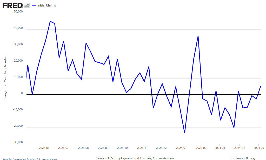
There was a bit of a scare a few weeks ago seemingly related to the different timing of the Easter Holiday. That has been repaid and as we look forward what we would like to see is the level of improvement run a bit better than 40K to make up for the genuinely bad luck of last Spring.
However, the general message is that the glide path of improvement has been pretty steady for over a year now.

4 comments
Comments feed for this article
Thursday ~ May 10th, 2012 at 6:49 pm
Nick
It’s worth noting that if Wisconsin had grown at the same rate as the rest of the country rather than terminating 20,000 jobs as a result of a manufactured budget crisis last year the jobs numbers for this quarter would have been excellent.
Thursday ~ May 10th, 2012 at 6:51 pm
Nick
No, you know what, I’m mixing up quarterly and yearly numbers. Don’t pay any attention to me. Next time I’ll double check before I comment.
Thursday ~ May 10th, 2012 at 7:51 pm
rjs
more layoffs a year ago were due to fukushima…
less layoffs, less hiring, happy zilch…
Friday ~ October 14th, 2016 at 9:34 am
The Holiday Helpline - Holiday illness claims
Holiday Sickness Claims for Compensation with The Holiday Helpline, we are leaders in holiday related illness and accidents claims.